
duration
Jan 2022 - mar 2022
responsibilities
Research
UX/UI Design
Platform
Mobile app
(Concept)
Creating a tool that allows people of all levels of involvement to enjoy astronomy, features a friendly UI, intuitive functionalities and the possibility to share images and live video of the night sky.
The majority of stargazing apps are very polarizing, they either appeal to people who already know a lot about the hobby, which makes them not very appealing to first time users, or are quite bare in the features they offer, making them unsuitable for the more experienced hobbyists. Also, most of them don’t let you share the experience with others, so I set out with the goal of designing an app that met those demands.
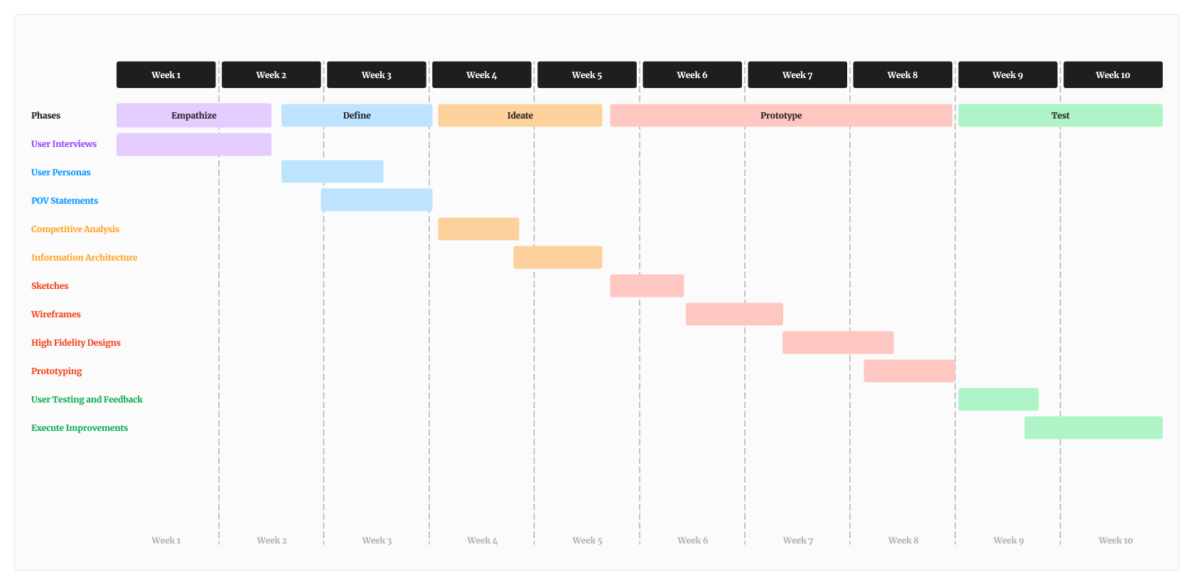
After defining a goal, I indentified that the most adequate method to use for research were quantitative + qualitative questions established on in-depth interviews with potential users.
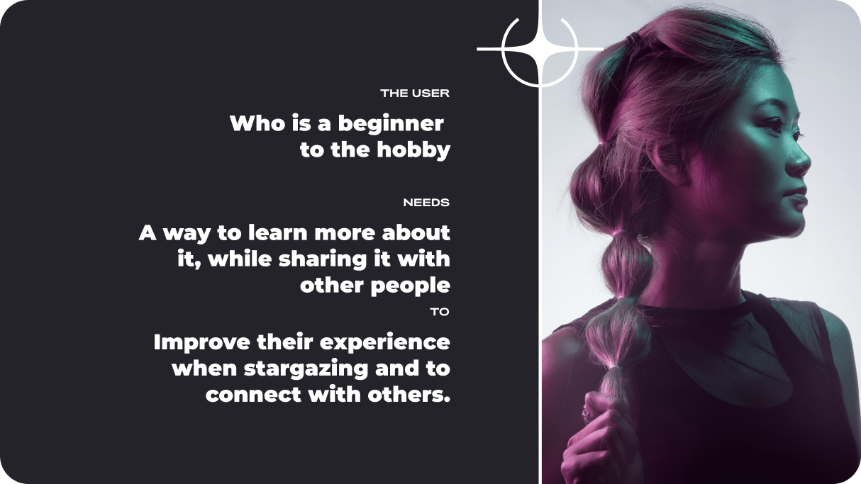
I interviewed 12 people, who either had an interest in stargazing, or that were already invested on different levels in the hobby.
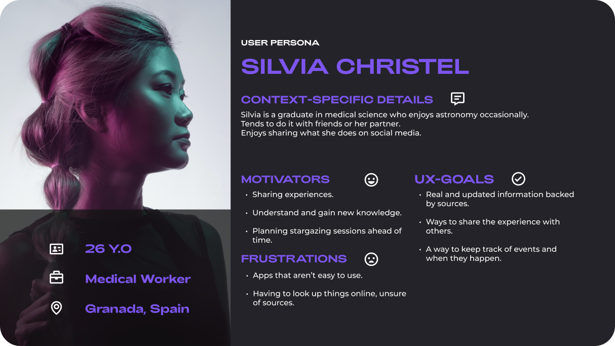
After conducting the interviews, I created User Personas and POV Statements in order to visualize the data about the motivators, difficulties and context-specific goals posed by said users, which were essential in creating a list of potential solutions.
Before tackling the architecture, I decided to analyze the direct competitors of out proposed product.
I made a competitive analysis to check the most important features that users look for on these apps as well as reading both positive and negative reviews left by the users in order to further understand their pain points and motivators
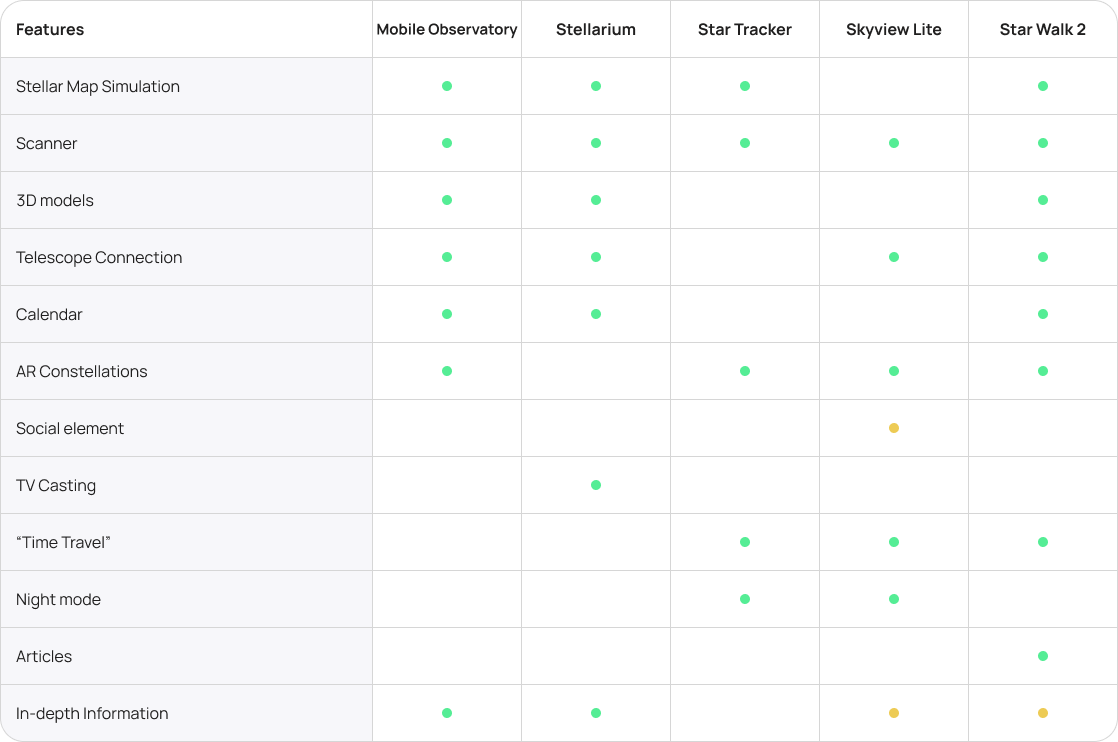
From here I could decide what actions and functionalities were really decisive and beneficial , so I proposed an architecture based on user insights.
I wanted to create an easy experience for the target users, making an emphasis on simplicity, giving users the possibility of sharing their stargazing experiencies via images and live video, providing popular and useful features that users of these types of apps might be accustomed to, and making sure the navigation was comfortable, simple and painless.

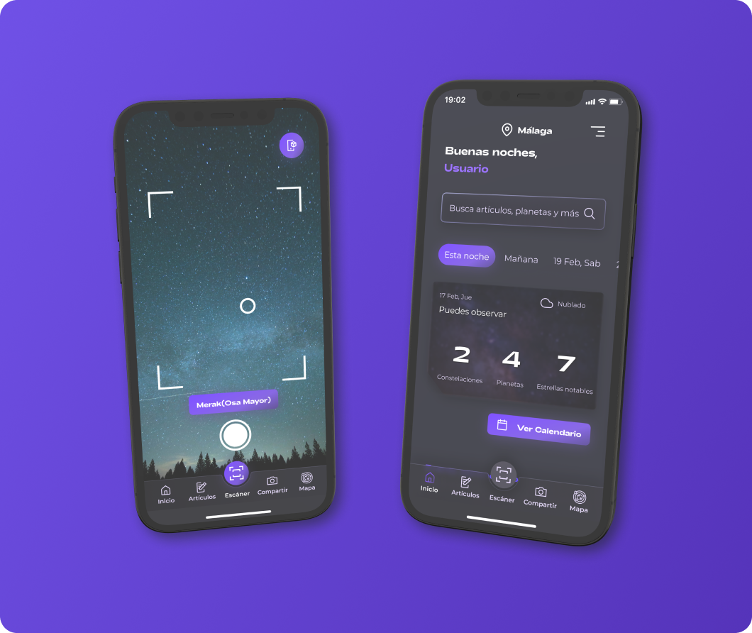
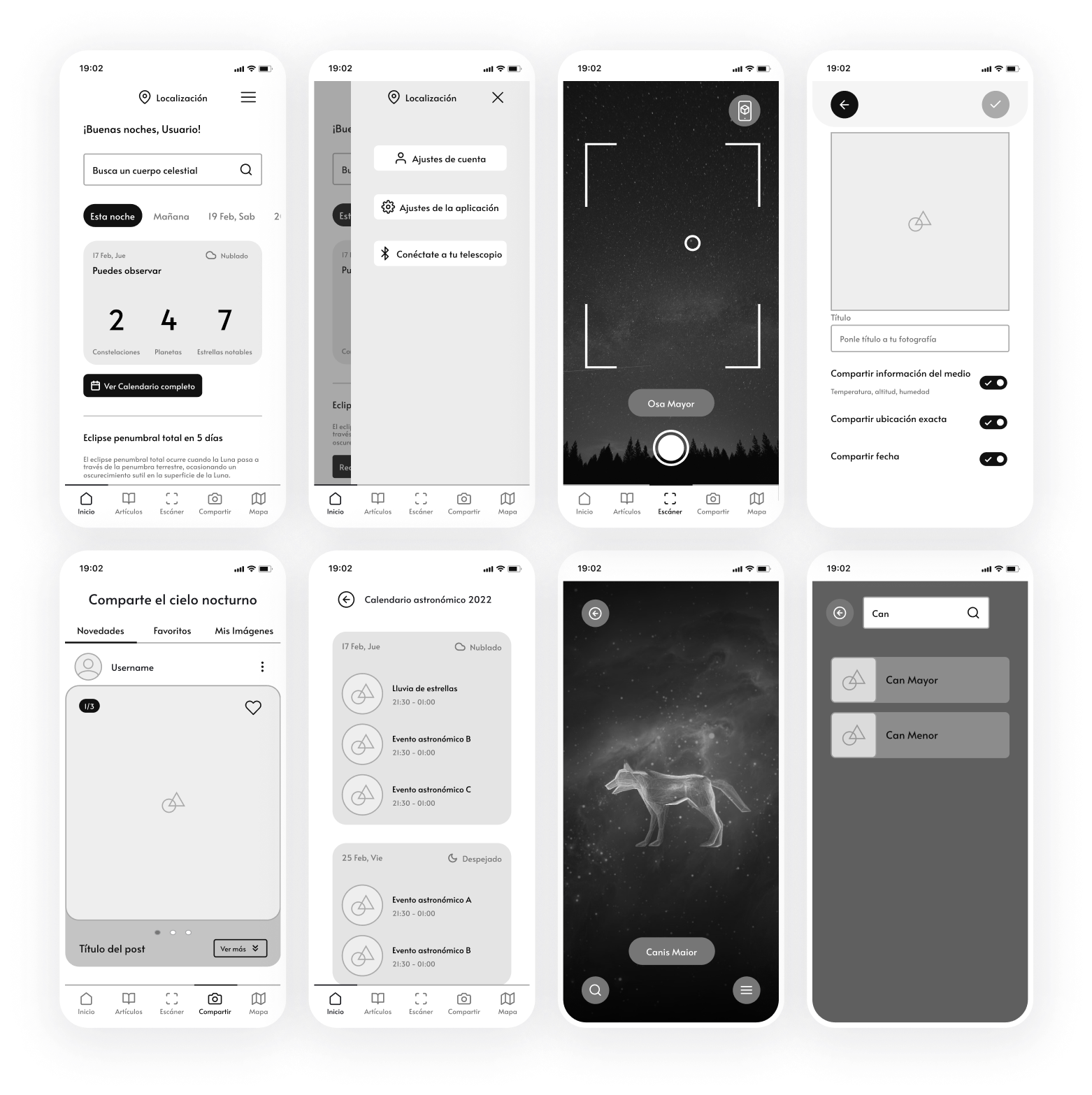
Once the architecture was established, I started sketching with pen and paper the low fidelity wireframes of the main user flow. After that I proceeded by developing them into mid fidelity ones and creating a prototype to test with the user group.
After designing the wireframes and linking them in a prototype, I tested them on a couple of users. I outlined tasks for them to perform and later analyzed them in order to understand the weaknesses of the proposed design.
You can test the prototype here:
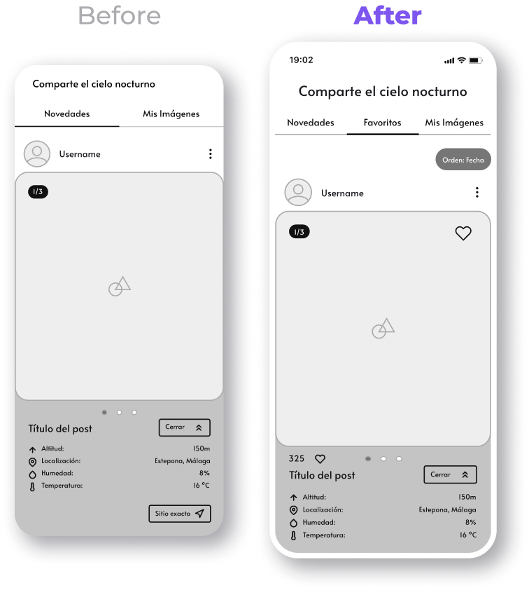
After gaining insights from the participants, I modified the wireframes and added some suggested features that were discovered during testing.
You can see some of the changes below.
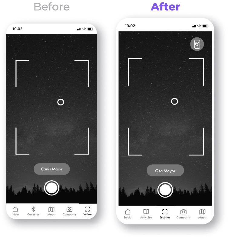
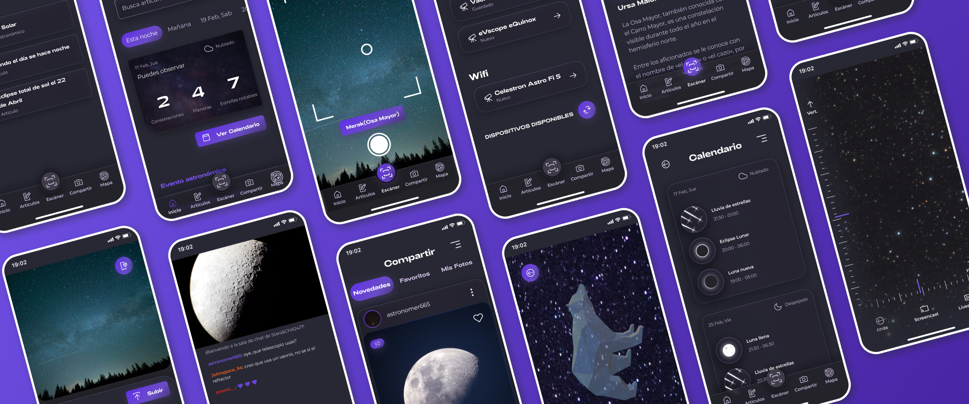
Added a discussed feature to have 3D models superimposed on the camera, acting as a sort of augmented reality map of different constellations and celestial objects.
Also changed the position of the scanner in the navigation menu from the feedback received from user testing.
Added a like system to the posts and a filter.
Now users have a way to save the ones they like and view them later.
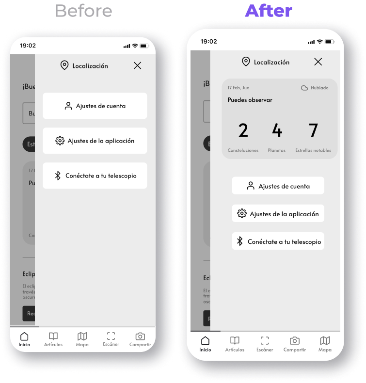
Reduced the size of the buttons on the hamburger menu.
Also added access to the calendar on it, so it can be viewed from almost any screen.
Once I completed the information architecture and I made a prototype from the wireframes, I started making a design system from which the screens would be created.
The most important things to take into account were choosing typefaces and colours that matched the tone and theme of the app, while taking into account it's use cases. (mainly being used on low light enviroments so I chose dark colours while maintaining good contrast)
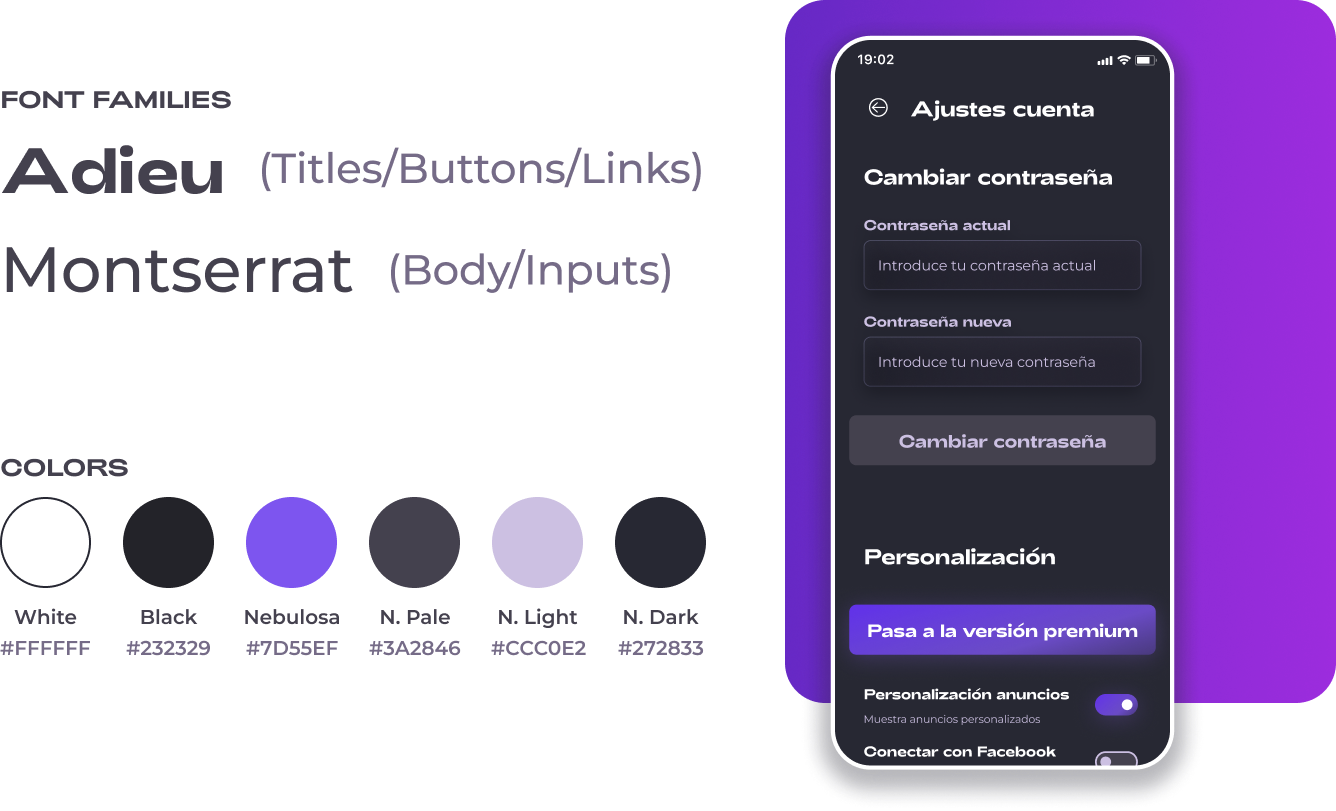
Then I created a typography and spacing scale to ensure hierarchy throughout the project is preserved.
The system not only improved efficiency during the design process, but it also made sure that the platform can, in the future, evolve and maintain good visual consistency.
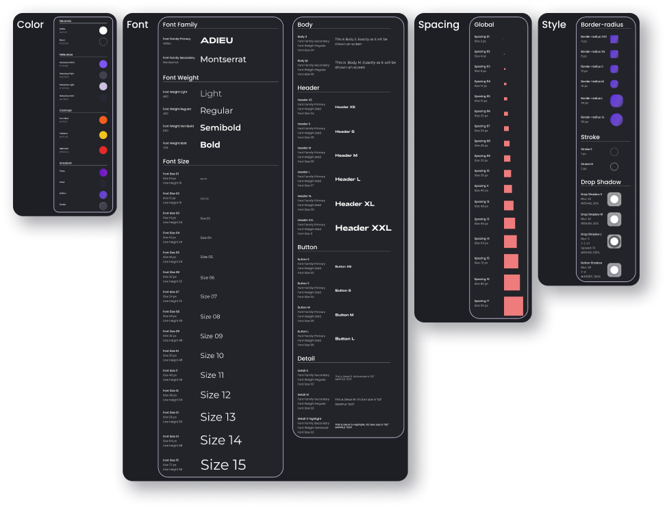
Showcase of the design system
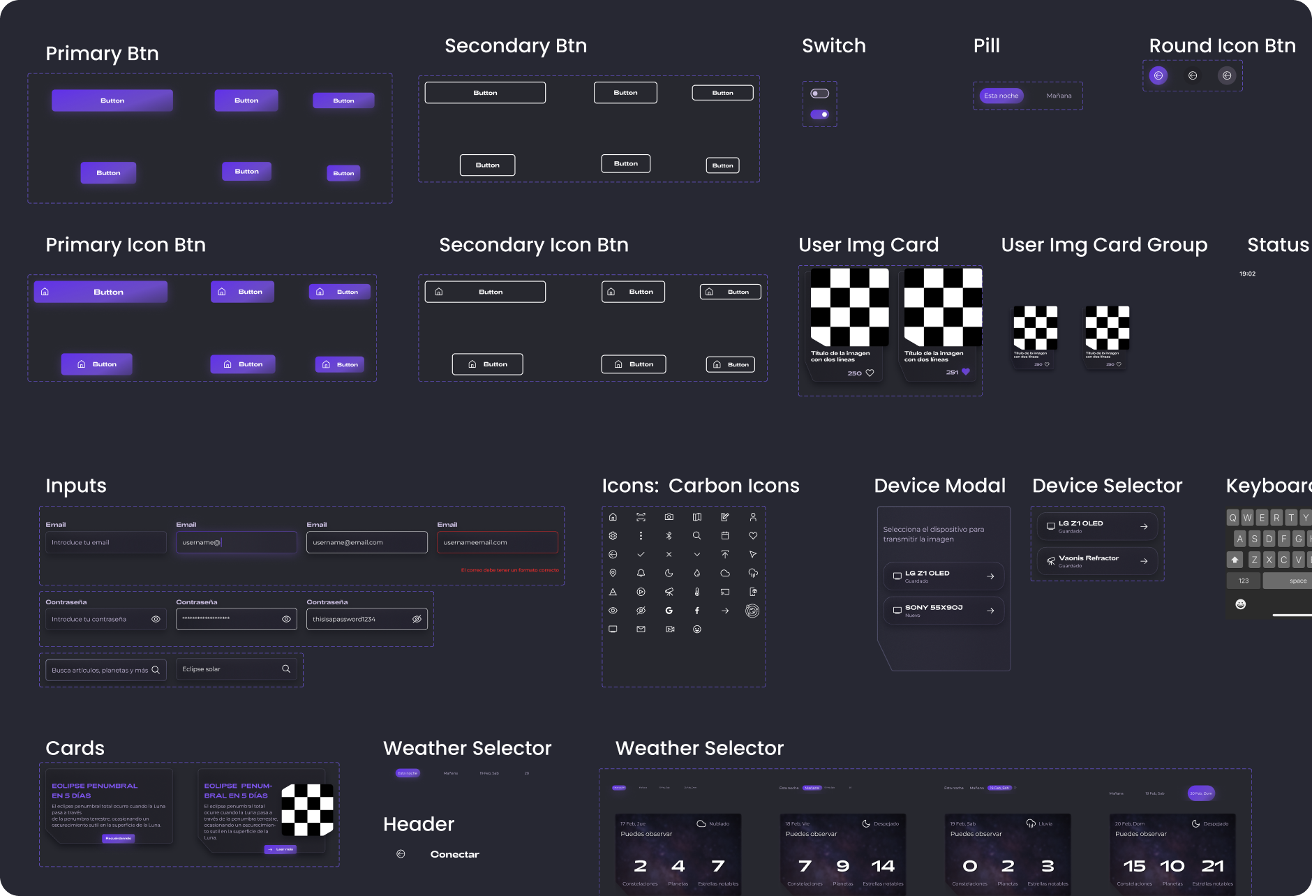
Showcase of some components created for the project
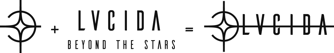
For the logo and app icon, I was inspired by two natural phenomenons, an image of a star called Alpha Monocerotis (also known as Lucida, name that means "the brightest star and also serves as the app's name) and an atmospheric optical phenomenon called parhelion/sun dog or mock sun that consists of a bright spot to both sides of the Sun.
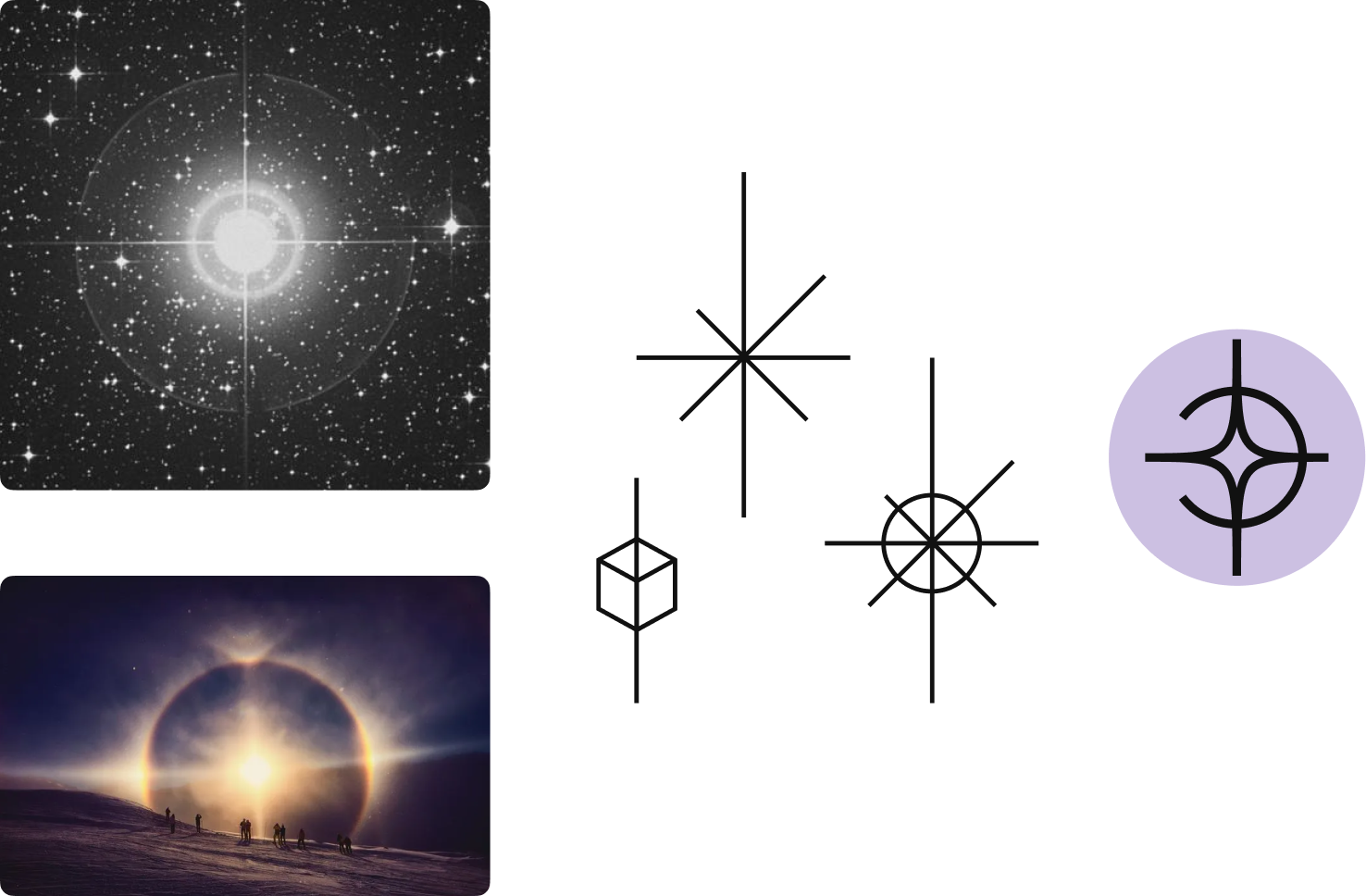
First draft of what shape I wanted the logo to be.
Variations and iterations upon the design, working towards an app icon too.
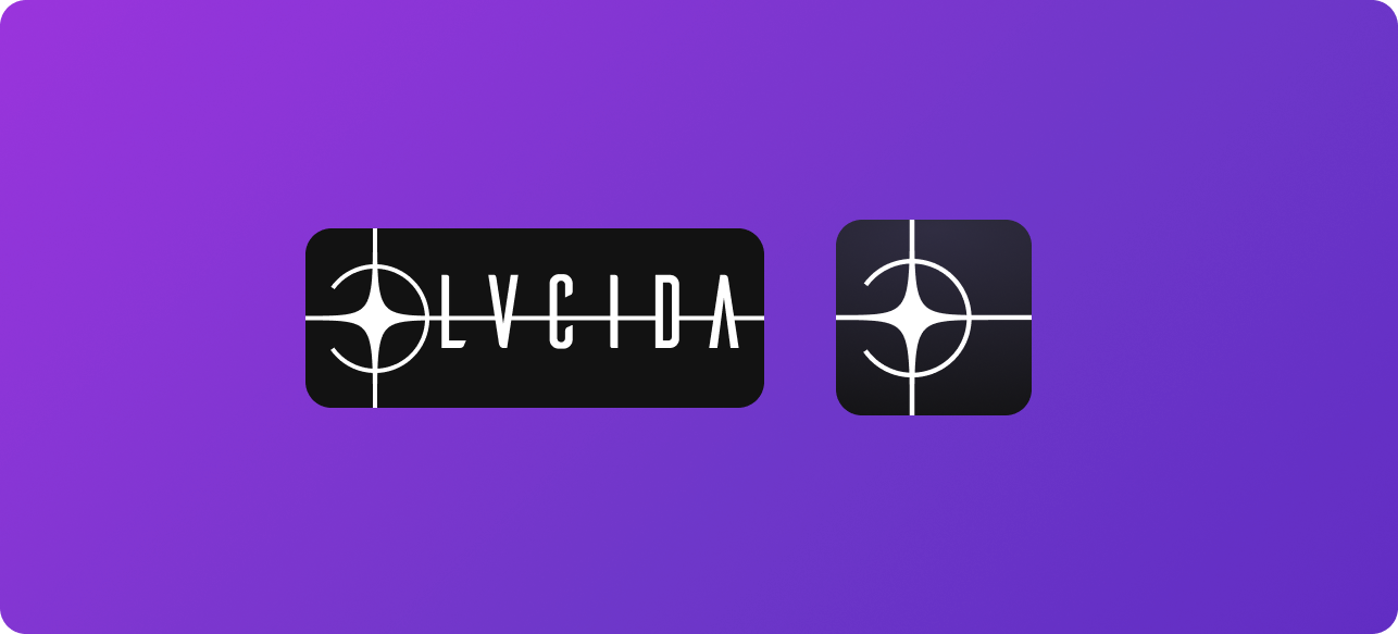
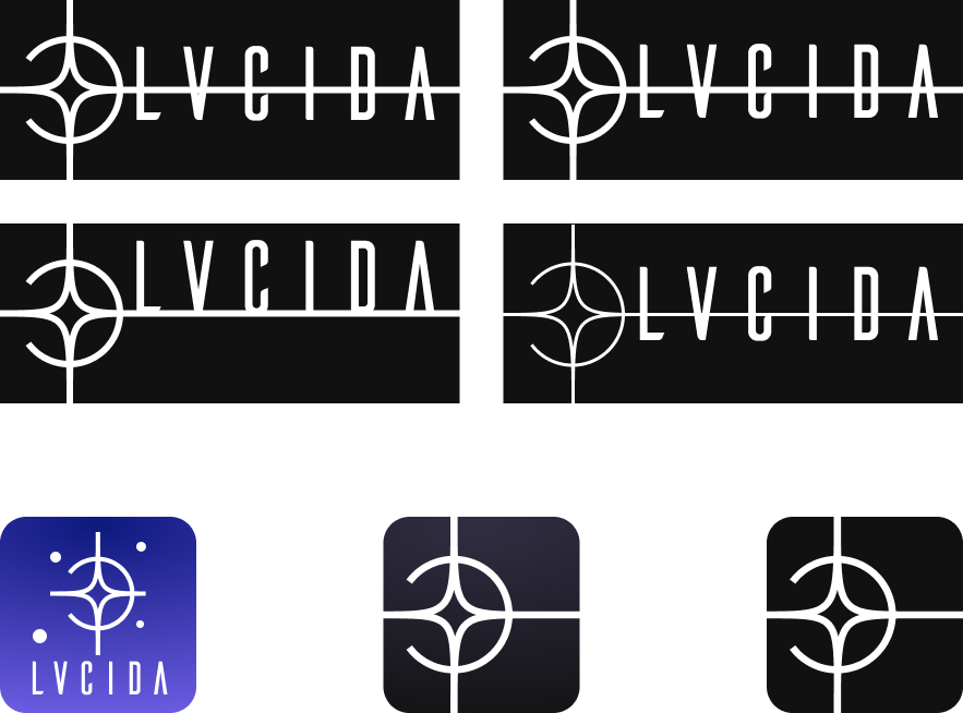
Final design of both the logo and the app icon.
I connected all the screens into a prototype with custom animations in Figma, which will allow me to test the app on the user group.
You can try the prototype here:
After I made the prototype, I tested it on 6 users. I again made a research plan by having some key tasks for the users to complete.
I primarily wanted to make sure that the key use cases for the app were smooth, easy and users were comfortable with the processes.
The tests were made in-person using Figma Mirror.
The main tasks included going through the login/signup and onboarding process, checking the calendar of astral events, using the scanner and getting information for a constellation, taking a picture of it and uploading it, checking information from other users' pictures, connecting a telescope and streaming the feed and playing around with the star map.
Side tasks included adding a picture to their favourites, checking and changing the app options, reading an article and watching a livestream.
During the tasks, I asked the users to talk through their process and point out when they found something unclear or that annoyed them in any way.
83.33% of participants (5 out of 6) were able to complete all of the tasks easily and without problem, the issues encountered were related to improper linking of prototype screens and problems with legibility under low screen light, both of which were solved after the first test.
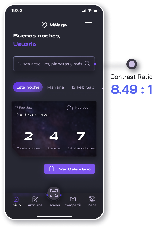
I evaluated the contrast of the app to, at least, AA standards.
All screens, frames and buttons where checked using a Figma contrast plugin and the Contrast Checker tool by WebAIM.
During the project I was able to conduct multiple in-depth user interviews, create lo-fi and hi-fi wireframes, put them together into a interactable prototype and perform both usability and accesibility testing.
It was one of my first big projects and it was a difficult and fullfilling journey where I learned a lot, but I strive to make even better projects in the near future by learning new things and to put to the test all the new abilities and insights I gained while taking on this challenge.
I'm looking for a place to learn, evolve, work in a team and contribute my skills and abilities
mariomadedesign@gmail.com


